OVERVIEW
Problem
Art galleries are a lovely place to hangout.
After covid and galleries reopening,the process of visiting an art gallery had to be streamlined.
The art gallery experience could be enriched and the pieces of display could be truly perceived from both the artist's and viewer's side .
There are three parts of the problem that I have focussed on in this case study:
- The waiting time of the queues,
- the confusing layout of the galleries and
- the way you get to know more about the display pieces.

Solution
I designed Vera,a mobile app that enables our users to seamlessly go through the entry process of the art gallery and add a touch to their art viewing experience.It allows users to view details about the art piece they are seeing through audio tours.Other additional details include gallery maps and an explore section where other activities at the art gallery are mentioned.
✨ The app was named Vera.
Vera means 'faith' or 'truth'.This word has a Russian origin.
✨ Another idea that popped into my mind was music.I love listening to music anywhere and what better way to go through the tour without some music.
You could listen to the audio clip telling your about the art piece,the process and what the outcome wishes to convey. Once you are finished with that,lets switch to music while you contemplate,relate and try to see a perception of that art.
RESEARCH
Initial research
When I first started with this project,I laid down some research goals and understood the span of my target audience before becoming specific with user personas.
Research goals
- Characteristics of your target audience
I jotted down some basic interview questions and tried to empathise and start thinking along the lines of the user.
- Interview questions
- Why do you visit art galleries or museums?
- What do you do once you reach an art gallery?
- What do you see at the gallery or do you cover each artwork completely?
- Do you feel that your experience could be enriched?
- How often do you visit these places?
- How invested are you in art?
- What do you see these places as?
I have worked on the 5 w's exercise before creating user personas.The questions and answers are given below
5 Ws framework
- Who is experiencing the problem?
By users who visit the art gallery or who plan to visit
- What is the problem?
They need to wait in queues to book the tickets
The gallery is too large that sometimes they get lost or cannot navigate through it smoothly
They want to know more about the artworks on display and the artist
- Where does the problem show up?
The problem shows up in the art gallery
- When does the problem occur?
It occurs when a person looks at the painting and is unable to find the artist or know more about his work
When they enter the gallery and get confused on where to start
When they think that visiting the gallery could be something more than just viewing the work
When they don't know the schedule of the art gallery
- Why is the problem important?
The person doesn't visit the gallery frequently to understand the layout and remember it
The person needs information for their personal or professional interests regarding the art
The person could save time by booking a ticket beforehand
Personas
The first step I took after laying down the research goals was persona creation and worked along their lines to empathise and touch pain points through them.I created four user personas and mapped out their journey,pain points and their respective problem statements.
The four personas are


✨ While persona creation,I try to include as many races,ethinicities and age groups possible.I try to be inclusive and have an extensive representative sample.
User Stories


I found out four pain points and four goals and tried to focus on them.I have drawn out their user journeys to understand that better.
- The user journey was mapped out in four steps:
- Go through the art gallery
- Scan the ticket qr
- Find the start destination of the tour
- Go through the tour smoothly
- Find the end destination of the tour
Problem Statements
The final step I took in the research phase was forming problem statements which concretised the main issues I had to work on and gave me a clear direction during brainstorming.The problem statements and the related hypothesis can be found when you click the above button to view detailed personas.
IDEATION
Crazy Eights
This was one of my favourite parts of the whole process.I kickstarted the ideation process by Crazy Eights.This method works well for me and proved to be effective as it is always the last one minute pressure that tick something different in my brain and a crazy idea drops out.
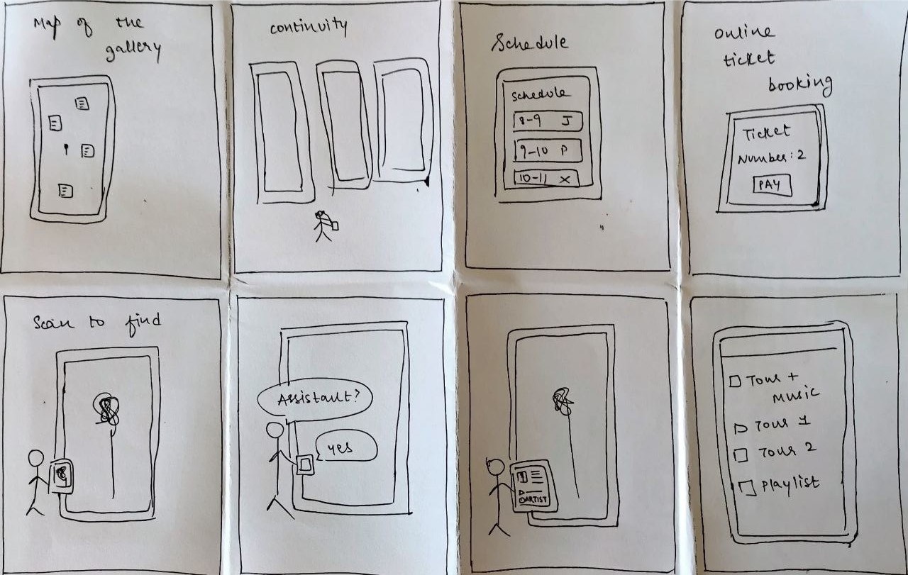
I worked and developed the ideas and conducted a brief brainstorming sessions.
The outcome of the session can be seen below in the form of a chart displaying the various directions I could start working in:
✨ Crazy eights exercise really helped me a lot.The last one minute pressure really brings out some crazy ideas,that was how I got the music idea part.
Competitive Analysis
One of the most crucial steps in the whole process was :Competitive Analysis.This is the part where you already know what works for the market and what doesn't.I got an entire feel of the design and I had a brief idea of how my design should look and feel.
I conducted competitive audits on two apps namely VoiceMap and Smartify.
Smartify was a direct competitor whereas VoiceMap was an indirect competitor.
Competitive audits were conducted on the terms of their and desktop experience,interaction,accessibility,user flow,tone and descriptiveness.
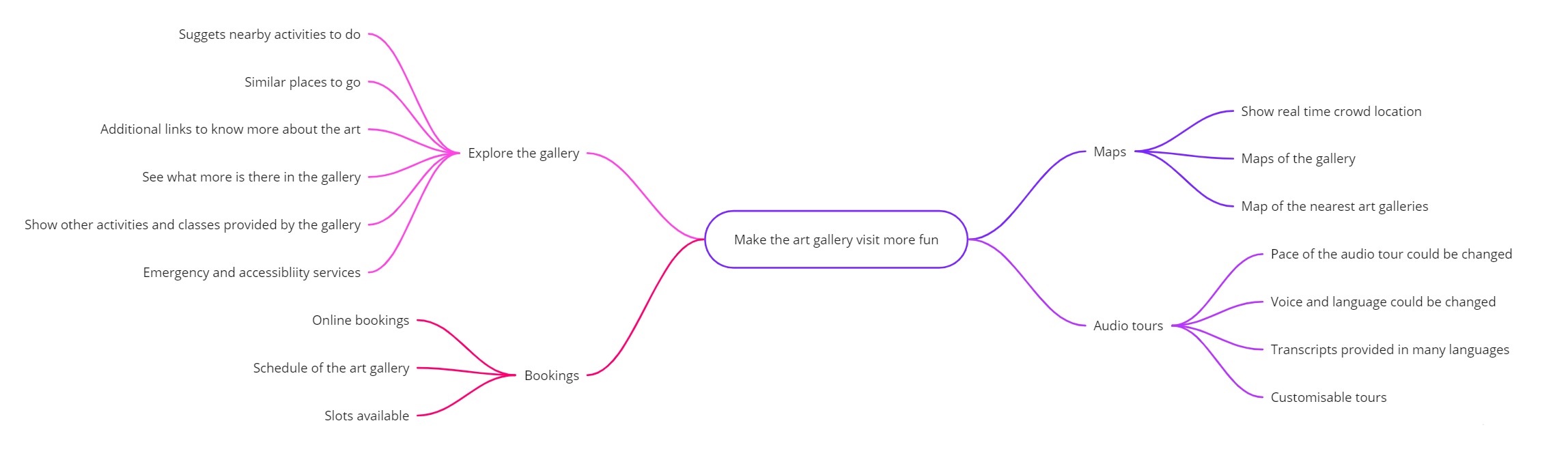
Value Proposition
A value proposition was created for the project stakeholders i.e. myself and art gallery visitors and art gallery managing authorities.
I found this step important as however random your ideation is or how many crazy ideas you have come up with,it is nothing till you jot them down,check the feasibility or come up with ways to apply them.After this I gathered my ideas and started picking out the ones I wished to work on.
I came up with these basic ideas during different steps of brainstorming and ideation:

✨ Value proposition was the most helpful and necessary step in the ideation phase. It really gave a direction to the ideas I gathered.So I made a point to follow it for all my projects hence forth.
User Sitemaps
The user personas each highlighted a specific pain point.To work specifically in that direction and to make sure they are resolved,I charted user sitemaps for these situations.
I focussed on Linda as the primary persona so this is her user sitemap.
Storyboarding
An extension of the sitemapping is story boarding.I had a pictorial representation of the user sitemaps with me.
- My storyboarding session consisted of two parts:
- Big picture storyboarding
- Close up storyboarding
Taking Linda as my primary persona,I sketched out her steps and actions for a visit to the art gallery
I started with a bigpicture storyboard which shows when and where she uses the app.
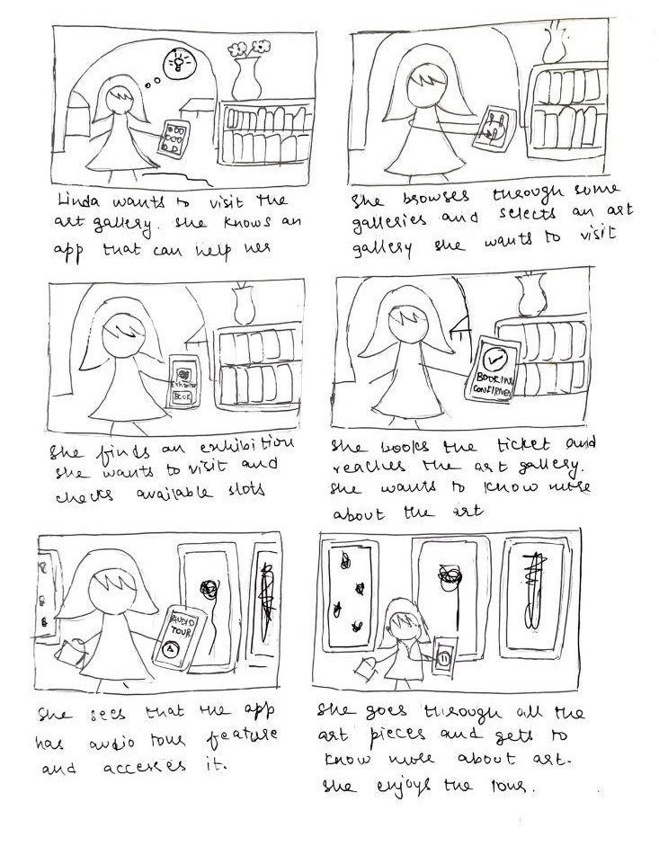
The next story board is a closeup storyboard which focusses on how she uses the app and her interactions with the interface that I plan to accomplish.
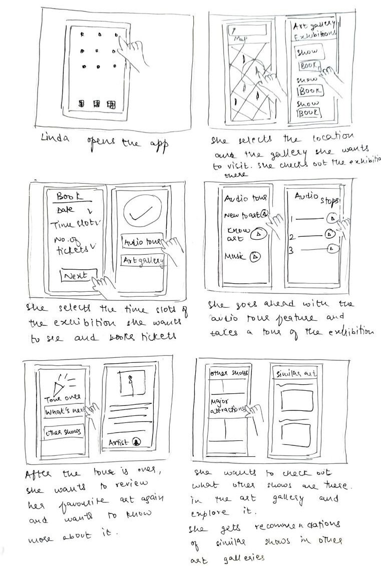
I have tried to focus on the user,my personas.My main motive was to keep empathy and their point of view in mind,every step of the way.
DESIGN
Sketches and Wireframes
After the ideation phase,I started creating paper wireframes.This step was really fulfilling as I could see my ideas take shape.The main advantage of this stage is that it is quick to make and easy to change.
I drew up atleast two to three layouts for the same page and finalised the one I found most suitable.
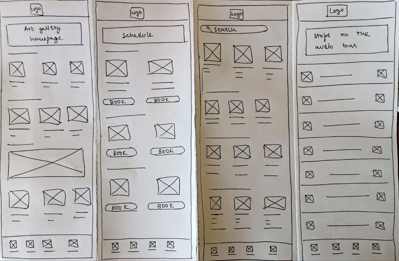
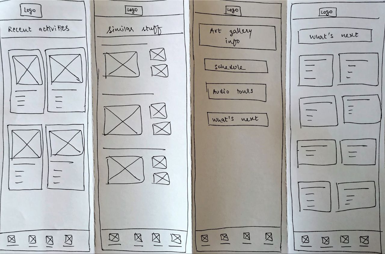
After the paper wireframing was done,I proceeded to creating digital wireframes.A few examples of the digital wireframes are shown below:

✨ This project has an app design as the main users of Vera will be mobile users.This worked hand in hand with the fact that the next billion users will use a mobile phone first.
Prototyping
Protyping was done in two stages:low fidelity and high fidelity.The low fidelity stage focussed on the usability of the design.
The main aim of the low fidelity prototype was to have a working framework which could be ready for testing before I increase the fidelity.I wanted to see if the users were able to navigate easily through the prototype and complete basic tasks of the app design.
The high fidelity stage focussed on the colours and the branding of the design.
✨ Figma was used in all the prototyping and digital wireframing stages.
Low to high fidelity
I linked the pages according to my user flow.
When I was move according to the user flow,I found many holes or pages I did not consider during the wireframing.Those parts were filled during the low fidelity prototyping stage.
After working on the basic flows and rectifying it,some of the basic user flows look like:


✨ The first mockup was full of colours.

EVALUATIONS AND ITERATIONS
User Testing Process
The low fidelity prototype was used for the user testing process.The participants were given the prototype to complete basic tasks in an unmoderated user study.
The user study plan included the activities to be performed and a basic script for me to follow.
An overview of the script is given below:
- Introduce the project goal, and put users at ease.
- Describe the scenario, set up the context, and let users use the app while thinking aloud.
- Ask follow up questions and gather feedback.
- Let users fill out a questionnaire. Thank them for participating.
You can find the User research study plan below:
✨ I needed the participants to belong to different parts of the representative sample.The easiest way to accomplish that was to recruit participants from different age groups.
Measuring Success
The main goal of the usability study was to ensure that the primary features of the app were discoverable and the user flow was in an expected order.
The KPIs(Key Performance Indicators) were:
- Time on task-How much time does it take to book a slot to visit the gallery?
- Conversion rates-How many users are able to book tickets and access the audio tours?
- User error rates-How often do the users get stuck or make errors while using the app?

The KPIs helped me to identify the faults in navigation of the app and helped me rectify the roadblocks often faced by the users.
✨ My brother is one of my biggest critic.He has given the most beneficial feedback when it comes to my designs.
Results
I was able to gather plenty of feedback regarding the usability flow from the participants of the study.I had five participants who helped in the user testing evaluation.Here's a summary of how people comfortable with the process and the roadblocks they faced on the way.

The conclusion seemed pretty clear that the prototype needed working on to increase the discoverability.I worked on the low fidelity prototype and iterated it to a proper version before moving on to the high fidelity prototype.
The high fidelity protoytpe was mainly focussed on the colour palette and the branding.
Feedback and Design Iterations
The roadblocks they faced were gathered in one place and sorted accordingly.The affinity mapping of the common themes and insights gained from the study are shown below:
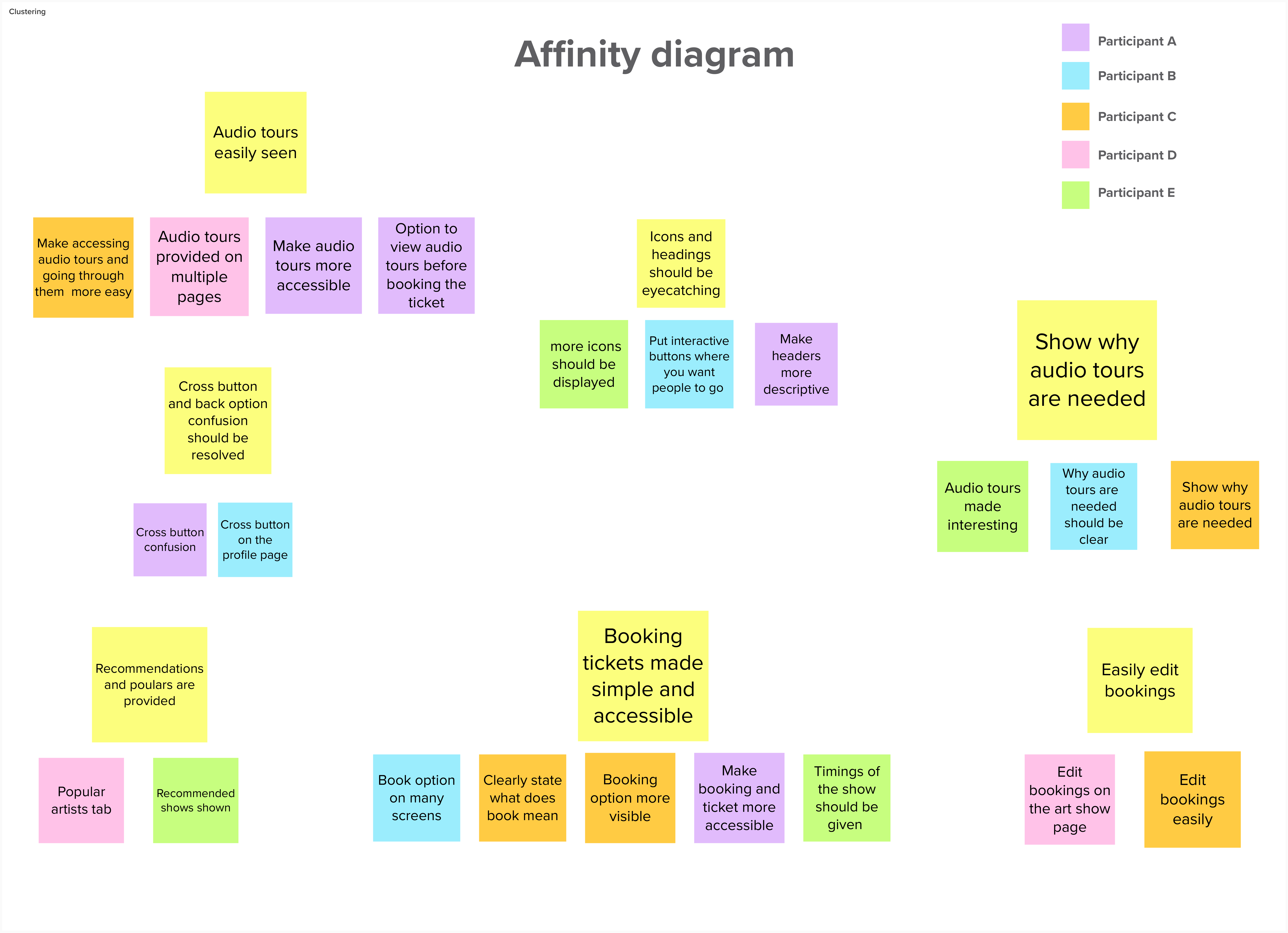
The key points were gathered from the above affinity mapping.I worked on them and came up with first iteration of the app design.
Homepage
The book a show option was a lot more discoverable and accessible.Similarly the audio tour option was kept front and center.Features which engage art patrons and new visitors alike,need to be worked on in the next iteration.

Navigation bar
The main navigation bar was changed to accomodate an audio tour option for ease of accessibility and so that the users tend to explore that feature more.

Recommended galleries
The section of recommended galleries will provide a lot more details so that art enthusiasts get all the information they need

Profile
The setting option seemed futile and an option to manage your likes would be more convenient to the users.
The major difference between a like and a bookmark is the fact that you can like several paintings,art displays and galleries but the bookmarks are more personalised and show your preferances

Book option
The placement of the book or view option was increased so that the same page ,i.e. where the online booking of the exhibition starts,was easy to arrive at.


Bookmarks
Bookmarking is personalised and stores the whole art aura or the art appreciating part of the person.I could think more creatively on the lines and come up with something beautiful in the next iteration.

QR ticket
I placed the QR ticket at a more convenient place which is easily accesible.

✨ The project took about 2 months(May 2022- June 2022)
LATEST PROTOTYPE
Here's the latest prototype of Vera.
Further changes to the design based on user feedback will be posted soon.
✨ While finalising an app name,many names like PrimaVera,Verdana and Abstract were considered.
The app was finally named Vera.
ACCESSIBILITY AND INCLUSIVITY
How I planned to be accessible

✨ I tried to keep accessibility,equity based design and inclusivity in mind every step of the way. The app could be made more accessible and that will be focussed on during the upcoming iterations.
Takeaway

FUTURE STEPS


✨ The only permanent step in this project is iteration and I plan to soon work on the next steps.
OVERVIEW
Problem
Art galleries are a lovely place to hangout.
After covid and galleries reopening,the process of visiting an art gallery had to be streamlined.
The art gallery experience could be enriched and the pieces of display could be truly perceived from both the artist's and viewer's side .
There are three parts of the problem that I have focussed on in this case study:
- The waiting time of the queues,
- the confusing layout of the galleries and
- the way you get to know more about the display pieces.
Solution
I designed Vera,a mobile app that enables our users to seamlessly go through the entry process of the art gallery and add a touch to their art viewing experience.It allows users to view details about the art piece they are seeing through audio tours.Other additional details include gallery maps and an explore section where other activities at the art gallery are mentioned.
✨ The app was named Vera.
Vera means 'faith' or 'truth'.This word has a Russian origin.
✨ Another idea that popped into my mind was music.I love listening to music anywhere and what better way to go through the tour without some music.
You could listen to the audio clip telling your about the art piece,the process and what the outcome wishes to convey. Once you are finished with that,lets switch to music while you contemplate,relate and try to see a perception of that art.
RESEARCH
Initial research
When I first started with this project,I laid down some research goals and understood the span of my target audience before becoming specific with user personas.
Research goals
- Characteristics of your target audience
I jotted down some basic interview questions and tried to empathise and start thinking along the lines of the user.
- Interview questions
- Why do you visit art galleries or museums?
- What do you do once you reach an art gallery?
- What do you see at the gallery or do you cover each artwork completely?
- Do you feel that your experience could be enriched?
- How often do you visit these places?
- How invested are you in art?
- What do you see these places as?
I have worked on the 5 w's exercise before creating user personas.The questions and answers are given below
5 Ws framework
- Who is experiencing the problem?
By users who visit the art gallery or who plan to visit
- What is the problem?
They need to wait in queues to book the tickets
The gallery is too large that sometimes they get lost or cannot navigate through it smoothly
They want to know more about the artworks on display and the artist
- Where does the problem show up?
The problem shows up in the art gallery
- When does the problem occur?
It occurs when a person looks at the painting and is unable to find the artist or know more about his work
When they enter the gallery and get confused on where to start
When they think that visiting the gallery could be something more than just viewing the work
When they don't know the schedule of the art gallery
- Why is the problem important?
The person doesn't visit the gallery frequently to understand the layout and remember it
The person needs information for their personal or professional interests regarding the art
The person could save time by booking a ticket beforehand
Personas
The first step I took after laying down the research goals was persona creation and worked along their lines to empathise and touch pain points through them.I created four user personas and mapped out their journey,pain points and their respective problem statements.
The four personas are
✨ While persona creation,I try to include as many races,ethinicities and age groups possible.I try to be inclusive and have an extensive representative sample.
User Stories
I found out four pain points and four goals and tried to focus on them.I have drawn out their user journeys to understand that better.
- The user journey was mapped out in four steps:
- Go through the art gallery
- Scan the ticket qr
- Find the start destination of the tour
- Go through the tour smoothly
- Find the end destination of the tour
Problem Statements
The final step I took in the research phase was forming problem statements which concretised the main issues I had to work on and gave me a clear direction during brainstorming.The problem statements and the related hypothesis can be found when you click the above button to view detailed personas.
IDEATION
Crazy Eights
This was one of my favourite parts of the whole process.I kickstarted the ideation process by Crazy Eights.This method works well for me and proved to be effective as it is always the last one minute pressure that tick something different in my brain and a crazy idea drops out.
I worked and developed the ideas and conducted a brief brainstorming sessions.
The outcome of the session can be seen below in the form of a chart displaying the various directions I could start working in:
✨ Crazy eights exercise really helped me a lot.The last one minute pressure really brings out some crazy ideas,that was how I got the music idea part.
Competitive Analysis
One of the most crucial steps in the whole process was :Competitive Analysis.This is the part where you already know what works for the market and what doesn't.I got an entire feel of the design and I had a brief idea of how my design should look and feel.
I conducted competitive audits on two apps namely VoiceMap and Smartify.
Smartify was a direct competitor whereas VoiceMap was an indirect competitor.
Competitive audits were conducted on the terms of their and desktop experience,interaction,accessibility,user flow,tone and descriptiveness.
Value Proposition
A value proposition was created for the project stakeholders i.e. myself and art gallery visitors and art gallery managing authorities.
I found this step important as however random your ideation is or how many crazy ideas you have come up with,it is nothing till you jot them down,check the feasibility or come up with ways to apply them.After this I gathered my ideas and started picking out the ones I wished to work on.
I came up with these basic ideas during different steps of brainstorming and ideation:
✨ Value proposition was the most helpful and necessary step in the ideation phase. It really gave a direction to the ideas I gathered.So I made a point to follow it for all my projects hence forth.
User Sitemaps
The user personas each highlighted a specific pain point.To work specifically in that direction and to make sure they are resolved,I charted user sitemaps for these situations.
I focussed on Linda as the primary persona so this is her user sitemap.
Storyboarding
An extension of the sitemapping is story boarding.I had a pictorial representation of the user sitemaps with me.
- My storyboarding session consisted of two parts:
- Big picture storyboarding
- Close up storyboarding
Taking Linda as my primary persona,I sketched out her steps and actions for a visit to the art gallery
I started with a bigpicture storyboard which shows when and where she uses the app.
The next story board is a closeup storyboard which focusses on how she uses the app and her interactions with the interface that I plan to accomplish.
I have tried to focus on the user,my personas.My main motive was to keep empathy and their point of view in mind,every step of the way.
DESIGN
Sketches and Wireframes
After the ideation phase,I started creating paper wireframes.This step was really fulfilling as I could see my ideas take shape.The main advantage of this stage is that it is quick to make and easy to change.
I drew up atleast two to three layouts for the same page and finalised the one I found most suitable.
After the paper wireframing was done,I proceeded to creating digital wireframes.A few examples of the digital wireframes are shown below:
✨ This project has an app design as the main users of Vera will be mobile users.This worked hand in hand with the fact that the next billion users will use a mobile phone first.
Prototyping
Protyping was done in two stages:low fidelity and high fidelity.The low fidelity stage focussed on the usability of the design.
The main aim of the low fidelity prototype was to have a working framework which could be ready for testing before I increase the fidelity.I wanted to see if the users were able to navigate easily through the prototype and complete basic tasks of the app design.
The high fidelity stage focussed on the colours and the branding of the design.
✨ Figma was used in all the prototyping and digital wireframing stages.
Low to high fidelity
I linked the pages according to my user flow.
When I was move according to the user flow,I found many holes or pages I did not consider during the wireframing.Those parts were filled during the low fidelity prototyping stage.
After working on the basic flows and rectifying it,some of the basic user flows look like:
✨ The first mockup was full of colours.
EVALUATIONS AND ITERATIONS
User Testing Process
The low fidelity prototype was used for the user testing process.The participants were given the prototype to complete basic tasks in an unmoderated user study.
The user study plan included the activities to be performed and a basic script for me to follow.
An overview of the script is given below:
- Introduce the project goal, and put users at ease.
- Describe the scenario, set up the context, and let users use the app while thinking aloud.
- Ask follow up questions and gather feedback.
- Let users fill out a questionnaire. Thank them for participating.
You can find the User research study plan below:
✨ I needed the participants to belong to different parts of the representative sample.The easiest way to accomplish that was to recruit participants from different age groups.
Measuring Success
The main goal of the usability study was to ensure that the primary features of the app were discoverable and the user flow was in an expected order.
The KPIs(Key Performance Indicators) were:
- Time on task-How much time does it take to book a slot to visit the gallery?
- Conversion rates-How many users are able to book tickets and access the audio tours?
- User error rates-How often do the users get stuck or make errors while using the app?
The KPIs helped me to identify the faults in navigation of the app and helped me rectify the roadblocks often faced by the users.
✨ My brother is one of my biggest critic.He has given the most beneficial feedback when it comes to my designs.
Results
I was able to gather plenty of feedback regarding the usability flow from the participants of the study.I had five participants who helped in the user testing evaluation.Here's a summary of how people comfortable with the process and the roadblocks they faced on the way.
The conclusion seemed pretty clear that the prototype needed working on to increase the discoverability.I worked on the low fidelity prototype and iterated it to a proper version before moving on to the high fidelity prototype.
The high fidelity protoytpe was mainly focussed on the colour palette and the branding.
Feedback and Design Iterations
The roadblocks they faced were gathered in one place and sorted accordingly.The affinity mapping of the common themes and insights gained from the study are shown below:
The key points were gathered from the above affinity mapping.I worked on them and came up with first iteration of the app design.
Homepage
The book a show option was a lot more discoverable and accessible.Similarly the audio tour option was kept front and center.Features which engage art patrons and new visitors alike,need to be worked on in the next iteration.
Navigation bar
The main navigation bar was changed to accomodate an audio tour option for ease of accessibility and so that the users tend to explore that feature more.
Recommended galleries
The section of recommended galleries will provide a lot more details so that art enthusiasts get all the information they need
Profile
The setting option seemed futile and an option to manage your likes would be more convenient to the users.
The major difference between a like and a bookmark is the fact that you can like several paintings,art displays and galleries but the bookmarks are more personalised and show your preferances
Book option
The placement of the book or view option was increased so that the same page ,i.e. where the online booking of the exhibition starts,was easy to arrive at.
Bookmarks
Bookmarking is personalised and stores the whole art aura or the art appreciating part of the person.I could think more creatively on the lines and come up with something beautiful in the next iteration.
QR ticket
I placed the QR ticket at a more convenient place which is easily accesible.
✨ The project took about 2 months(May 2022- June 2022)
LATEST PROTOTYPE
Here's the latest prototype of Vera.
Further changes to the design based on user feedback will be posted soon.
✨ While finalising an app name,many names like PrimaVera,Verdana and Abstract were considered.
The app was finally named Vera.
ACCESSIBILITY AND INCLUSIVITY
How I planned to be accessible
✨ I tried to keep accessibility,equity based design and inclusivity in mind every step of the way. The app could be made more accessible and that will be focussed on during the upcoming iterations.
Takeaway
FUTURE STEPS
✨ The only permanent step in this project is iteration and I plan to soon work on the next steps.